


St. Joe’s updated its COVID-19 Dashboard on Sept. 10 to provide case totals on a daily basis, as opposed to a weekly basis, which it had done prior to the update.
The updated dashboard provides “new daily cases” and “cumulative cases” with a breakdown of residential students, non-residential students and employees.
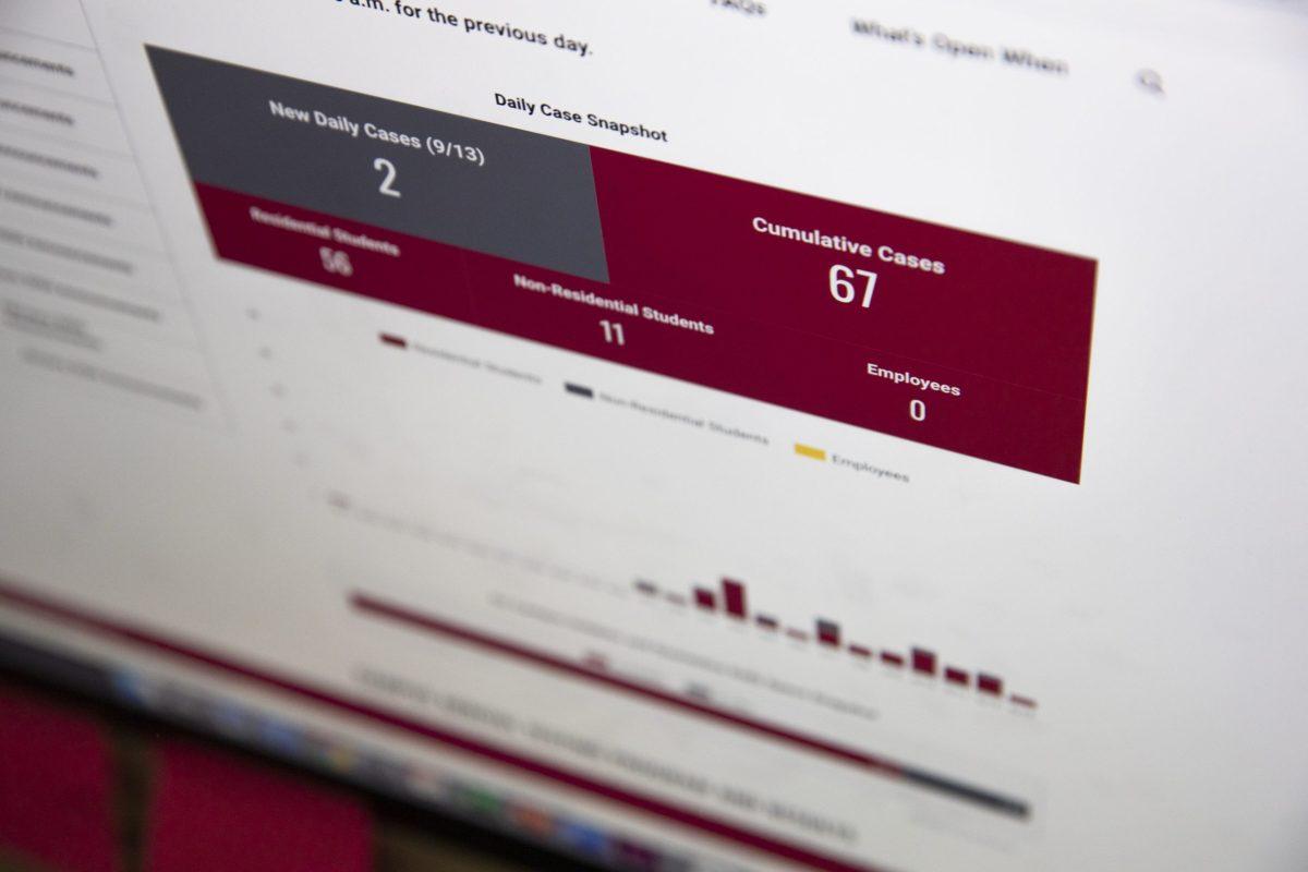
As of 9 p.m. on Sept. 14, the dashboard showed 67 positive COVID-19 cases among students, with two new cases reported on Sept. 13. That total consists of 56 residential students and 11 non-residential students.
The university has tested 1,738 residential students and approximately 2,800 students living off campus as of Sept. 11, according to Kelly Welsh, executive director of communications.
Most of these tests occurred during the first week of campus when the university recommended, then mandated, campus-arrival testing. Currently, the university only tests students on campus if they are symptomatic or have been exposed to someone who tested positive.
Laura Crispin, Ph.D., associate professor of economics, said the new dashboard is more useful than the old version.
“I’m grateful to the administration for listening to the concerns of the community about accurately conveying this information,” Crispin wrote in an email to the Hawk on Sept. 10. “Because the virus and the reporting of information are constantly in flux, it makes sense to report daily numbers and I appreciate that it was separated into broad categories.”
The Hawk reached out to Cary Anderson, Ed.D., associate provost and vice president for Student Life, to inquire about the number of students the Student Health Center is testing daily, as well as the number of students who have returned home to quarantine (and thus are not quarantining on campus). Anderson referred The Hawk to the Office of Marketing and Communications and said he passed the questions along. By press time, nobody from the Office of Marketing and Communications had responded.
The updated dashboard now includes the percentages of “in-use” and “available” on-campus quarantine and isolation spaces, but not actual numbers of students in those spaces. As of Sept. 13, the dashboard showed 83% of spaces “available” and 17% of spaces “in use.”
Cheryl McConnell, Ph.D., provost and vice president of Academic Affairs, said she did not know the total number of students in quarantine and isolation, and that the number was hard to pin down because the situation is so fluid. That’s why the percentages work best, she said.
“It changes every moment and every day,” McConnell said. “It just depends on the situation of students that test positive because we quarantine all the close contacts. That could be from one student to 10 students. Then the number of students that come out of quarantine are cleared.”
McConnell said as COVID-19 grew on campus, the dashboard needed to be enhanced in order to provide the university community with access to additional information. McConnell said she’s working to provide additional enhancements in the future, including collaborating with Kathleen Garwood, Ph.D., associate professor of decision and system sciences.
“We’re working on a couple of different models that could be interesting and are enhancements to the [current] dashboard,” McConnell said.
One enhancement Salvatore De Rienzo ’22, would like to see is the volume of testing per day.
“We don’t have a denominator,” De Rienzo said. “I realized that there could be difficulties in getting accurate denominators just because tests are going in and out so rapidly, but it is important to have that denominator just because you want to know the infectivity rate. Numbers don’t mean much unless you know it’s out of how many.”
Other area university dashboards provide this feature, including Villanova University, which communicates total daily testing, daily surveillance testing and daily diagnostic testing on its dashboard. Additionally, Temple University provides the number of tests done on a weekly basis.
Augusta Danley ’20, said she wants the university to more directly convey the information from the dashboard to university members who may not be looking at it or know where to find it on the university’s website.
“I want to see the university making sure students are aware of the dashboard,” Danley said. “We just got the one email saying ‘hey there’s a dashboard’ but then we never heard anything about it again. I want updates from the university.”
Danley said ideally those updates would include information about outbreaks in residence halls.
“There should be information on residence halls,” Danley said. “Students may have come in contact with individuals, even if it’s slight. Symptoms often show up later rather than earlier, so there can be grey areas in contact tracing. There should be data that shows what residence halls are being affected.”
Correction: A previous version of this story incorrectly stated that the “dashboard showed 83% of spaces ‘in use’ and 17% of spaces ‘available.’” The updated version states that “the dashboard showed 83% of spaces ‘available’ and 17% of spaces ‘in use.’”